Psychology of Color in SaaS Branding
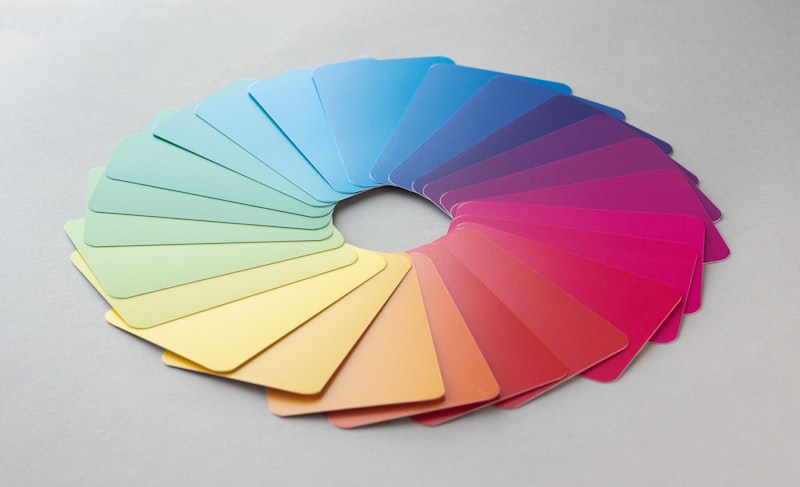
Colors aren't just aesthetic; they are emotional triggers that speak directly to the subconscious. In SaaS, where a user decides to stay or bounce in seconds, color is your most powerful tool. At WebPro Arts, our foundation in Blue and Aqua is a calculated strategic move designed to project stability and innovation.
The Science of Visual Trust
Because users "rent" software, they need to feel it is secure. Blue has historically been the choice for tech giants like IBM and Intel because it lowers the heart rate and creates a sense of professional calm.
The "Action Color" Strategy
One of the biggest mistakes is using brand colors for everything. If your website is blue and your "Sign Up" button is also blue, it becomes invisible. We advocate for the Isolation Effect. By using a high-contrast accent—like our bright Cyan—against a dark Navy background, we create a visual "shout."
The Dark Mode Revolution
In 2026, Dark Mode is a requirement. When designing for dark mode, bright colors like Aqua become luminous, creating a futuristic aesthetic that resonates with tech-savvy founders.
Summary: People don't just buy what your software does; they buy how it makes them feel. Use color to make them feel powerful and secure.
WebPro Arts Editorial
Expert strategies for modern digital brands. We don't just build websites; we engineer high-performance digital experiences. Work with us →